Such a change happened!
I painted a piece...
why not!?
images coming soon
Rachael McCallum's Unicorn Spew,
Rachael McCallum's UnicornSpew ~The online journal of Artness as-it-happens.
Friday, 12 October 2012
Saturday, 6 October 2012
 |
| Salt painting #1, 2011. Rachael. |
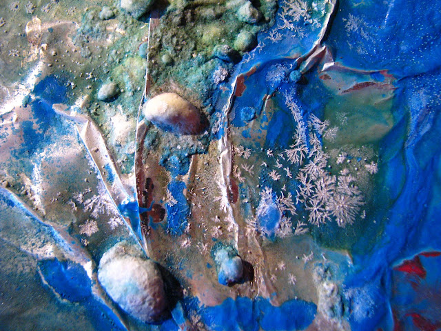
This incredible thing is a fraction of a larger piece that is in its totality, a large piece of salted joy. The salts are grown in a particular atmosphere that I was lucky enough to encounter before I got bored of the project. There are so many more photos that I intend to share as i explore the possibilities... maybe later
>ooh tension<
Friday, 5 October 2012
IT WAS A vom , until I saw the truth of the form...
THis, I did NOt REALISE it was a unicorn head until my friend pointed it out. Unfortunately it is not yet vomiting, it just has spreading ear infection. Delicious.
The thousands of possibilities that run through my head about what to do with this to finish it makes me really keen to melt some glass and throw in some rocks and glaze shards. It should definitely be pouring from the mouth hehehe...
Stay tuned for the final chundah effect.
Two halves of solid fun joy joy love rainbows
THis piece was once incredible until it snapped, and now it is fabulous cause I can change my mind about it as much as I like. WHen it comes to showing time, I will be decisive, but until then I have a pretty toy :)
PS; Hello fingertip. Welcome to my website.
HOW GReaT is that GREeeN WITH THAT PINK!? and the purple is a great underscore. I am Amazing. My unicorn is, I mean. THese go in the kiln and are white and pale greens and NOW! they are just joyful pieces of solid fun :D
PS; Hello fingertip. Welcome to my website.
HOW GReaT is that GREeeN WITH THAT PINK!? and the purple is a great underscore. I am Amazing. My unicorn is, I mean. THese go in the kiln and are white and pale greens and NOW! they are just joyful pieces of solid fun :D
THat lucky dragonfly is framed forever. He was dried up and his/her shell was sitting behind my desk, waiting for me to cremate it. I think I will fire this piece again to stoneware temp to make the bone be a more dramatic contrast. This R.I.P piece is still underconstruction, but I don't mind letting you see it.
There is too much blue.
Something isnt right. maybe I need to paint R.I.P across the top. THis random, generally insignificant insect can be observed by all!
R.I.P Bram Bogart.
I think your awesome
http://www.guardian.co.uk/artanddesign/2012/may/23/bram-bogart
I think your awesome
http://www.guardian.co.uk/artanddesign/2012/may/23/bram-bogart
HOw GreaT is the GReeN TeXture!!!! lovely.
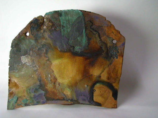
I did snap this piece, There was a bit that didnt look right, now i think some kid of drool or tassels might be interesting.
But I am definitely not sure about this curved edge and I dont just want to add things as if it will fix it. SO it is waiting for the answer.... keep tuned
Ps; yes I realise I am getting lazy with captions, maybe I will title them officially but essentially they are numbered. 2012.

ONly after photographing do I think that this piece belongs this way up. The grey is just SOOO heavy, and the warp of the edge is cool this way.
This tile needs to be sewn onto a grey furry cushion urgently, or else ill vom . I must immediately first-thing in the morn a.s.a.p. find a contrasting piece!
THis plate was the piece that made me snap! why bother with functional works when I have the worlds most fundamental mineral paints at my disposal!?
Kmart can make my cups, but I can make ceramic paintings!
Generally they remind me of vomit, maybe its the splashy action of glazing... But the colour transformation after fire is Le Unicorn.
actually now that i think about it, a dragon would have been a better metaphor.
...a bit too masculine.
(fire breathing unicorn?)
Thursday, 4 October 2012
This piece I made when I was just getting to know my boyfriend. Im not sure how Ithat is related to what it looks like now, but it is a personal milestone for me moving on from my old attitudes. He was with me when I made the form, when I was in a super great mood. I decided i needed to keep trying to clearly and simply communicate that I try to balance ceramic effects visually and this is what happened. The three string bars are framed by the two purple textured side ones. I love that chrome can make that exotic yellow, it is my favourite highlight :P it was thick enough to cover some of the texture and get darker in those areas. I think the composition really needed the dent and stripe at the bottom right. lucky really, it was an accident. This piece was also initially going to be glazed, and was made, sideways, but I like it how it is now. The spotted green panel steps out to meet us, hello!, but the chrome yellow is pushing back, - haha compete for my attention!
Wednesday, 3 October 2012
This piece was the beginning of my 2D exploration, and I don't think I could ever let go of it! Its actually very small ...
about the size of my open hand.
Simply dark iron celadon used in an ink like manner, red underglaze to activate the framing edges and I knew I would need something dry and white to balance so I mixed a bit of flux with mostly hydrated alumina and tin and - ta dah - balance with imbalance
Subscribe to:
Comments (Atom)


